Company
Embroker
Role
Product Designer
Timeline
3 Months
Insurance Quote-to-Bind: Price Tiers
Law firms are a third of Embroker's business, and the quote page is where they stalled – taking 3.2 visits on average to make a decision. I led the redesign to a three-tier quote with a rules-based recommendation, lifting quote-to-bind conversion 12%.


Optimizing the Quote Flow for Law Firms
Embroker is a digital insurance platform recommending coverage for small businesses. The law vertical serves 3,000+ firms and drives a third of revenue, so quote page friction carries weight. Funnel data showed a large drop-off between quote and bind, so our Q2 strategy was to test a Goldilocks pricing approach, and reduce human/broker intervention.
The Problem: Information Overload
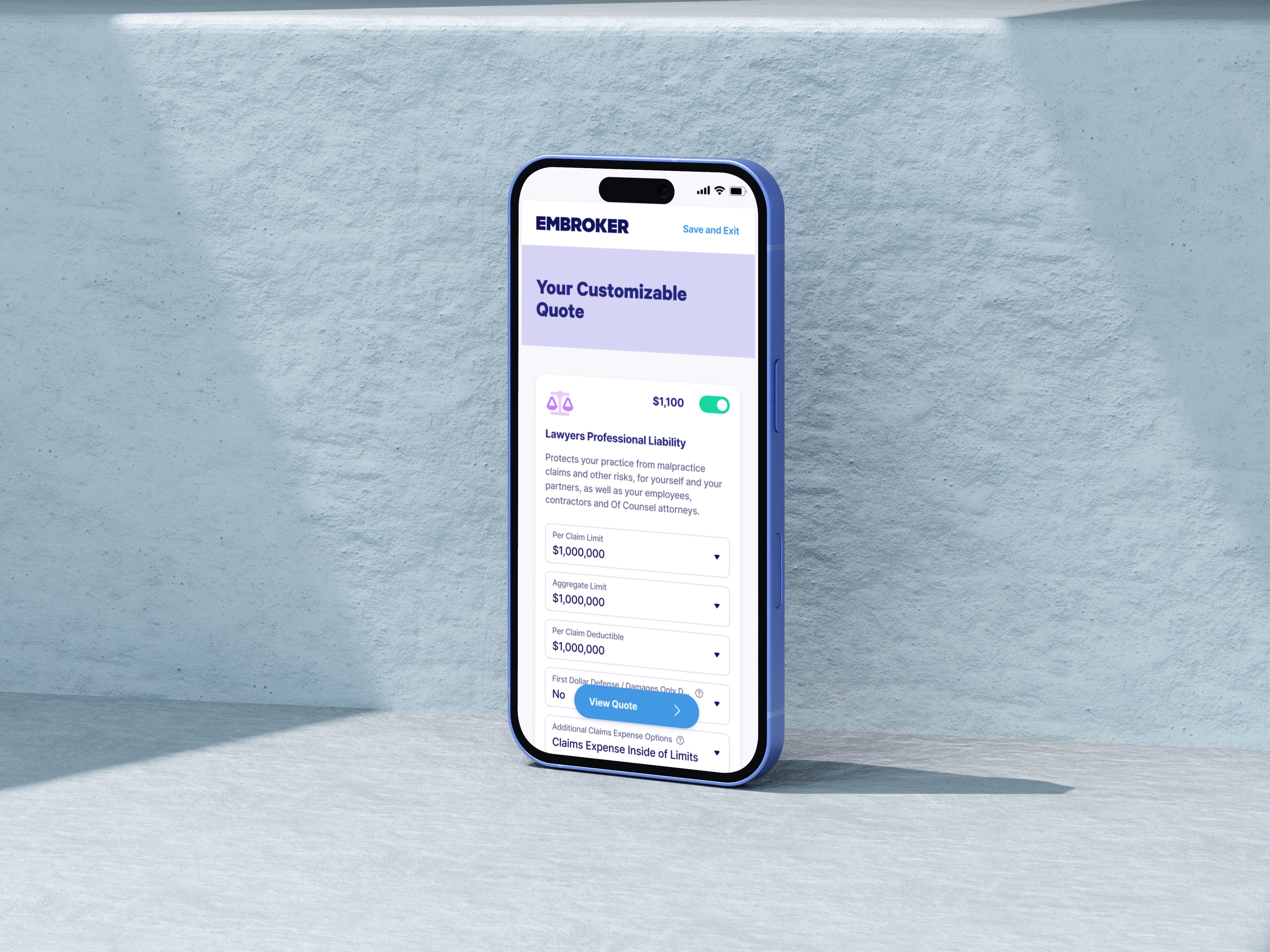
The quote page showed a single price buried under dropdowns, tooltips, and dense product information, leaving users to figure out limits on their own. Customer feedback pointed to confusing terminology, too much information, and brokers consitently requested for more pricing options.
What the research showed
Users visited the page 3.2 times before a decision, spent an average of 5 minutes on it, and heatmaps showed scattered click patterns. Only 31.6% of users who reached the quote page went on to purchase. One user put it best:
"It's kind of a big difference. This is like a $1,000 dollar swing. I'd probably be wondering why this is such a big range and what are the factors that it's really based on." That reframed the work from not just explaining the quote better, but giving users a real decision to make.


Heatmap showing scattered clicks (left); the original quote page (right)

Funnel analysis of drop-off from Heap
How We Got There
Followed the details in the data
Our analytics showed that the 11% of users who downloaded policy documents converted at 45%, versus 33% for those who didn't. Users looking for the details converted more. That justified listing documents on the tier page rather than hiding them.

Analytics showing downloads leading to a 45.5% conversion rate
Learned from how brokers build trust
An interview with a broker provided clarity to the solution: "You always present three options; they're going to pick the middle. If you only present one, you can't build trust."
This matched behavioral data, where people tend to choose the middle of three options.
Stayed honest about what a recommendation logic could deliver
With our PM and stakeholders, we scoped phase 1 to a logic-based recommendation, with rules based on traits like revenue and areas of practice. Earlier concepts asked users to rank what mattered most when shopping for insurance. I pushed to drop it, so the recommendation reflected the actual business, not self-reported preferences.
Firms needing much higher limits are referred to a broker through existing processes, bypassing the tier page instead of hitting a dead end.


Scoped logic for recommendations (left); early concept with user preferences (right)
Made the tier a starting point, not the end
I walked stakeholders through two design reviews to test the concept. Choosing a tier leads to a customization page pre-loaded with that tier's selections. This resolved the compliance question about showing complete quote information before binding. The first review split on whether to prioritize this or go straight to purchase, we shipped with tracking to let user behavior decide.
Designed for four eligibility states, not one happy path
The design had to work for fully eligible, partially eligible, referred, and ineligible users, across one or multiple products, on desktop, tablet, and mobile. Workers' Comp represented 30% of applications but was eligible only 39% of the time. Instead of just removing the policy, I designed a clear indication showing users why the policy wasn't available.


Designed state for users ineligible for Worker's Compensation
Addressed a 10+ second load time from three angles
The tier calculations took over 10 seconds to load. I devised a solution with engineering by exploring parallel quoting, reordering the questionnaire so products with longer API response times were calculated first, and adding a progress loading screen with value props. We chose value props over insurance terms because they were easier to absorb and reinforced Embroker's value.
Simplified the insurance terminology
The first review also showed that "basic vs. standard" didn't communicate a clear difference between tiers, so for v2, I worked with our content strategist and they became Starter, Enhanced, and Deluxe, and we shifted to positive language – "cost effective" instead of "minimum".
Stakeholders also asked for text explaining how each recommendation was calculated. The logic was too nuanced to summarize accurately in a few lines, so rather than oversimplify it, we cut the explainer and pointed users to the Key Insurance Terms section instead.


Version 1 of price tiers, prior to stakeholder review (left); version 2 with iterations (right)
What We Built
Three-tier quote page – Starter, Enhanced, and Deluxe, with a recommended tier preselected.
Customize and summary flow – a full customization page pre-loaded from the selected tier, followed by a summary page before bind.
Plain-language content – "deductible" instead of "retention," positively framed tiers, and clearer package descriptions.
Eligibility states – fully eligible, partially eligible, referred, and ineligible, and a broker referral for high-limit needs.
Loading screen – a progress bar and value props, paired with questionnaire reordering and parallel-quoting exploration.
Documents on the quote page – policy documents surfaced directly in the tier experience.


What Changed
Launched as a test against the original quote page, the redesign delivered a 12% relative increase in quote-to-bind conversion. This was a direct improvement to the step the project targeted, in the vertical that drives a third of company revenue.
Next steps include reviewing the CTA path tracking, reinstating the recommendation explainer, and adding the peer-benchmarking layer.
Company
Embroker
Role
Product Designer
Timeline
3 Months
Insurance Quote-to-Bind: Price Tiers
Law firms are a third of Embroker's business, and the quote page is where they stalled – taking 3.2 visits on average to make a decision. I led the redesign to a three-tier quote with a rules-based recommendation, lifting quote-to-bind conversion 12%.

Optimizing the Quote Flow for Law Firms
Embroker is a digital insurance platform recommending coverage for small businesses. The law vertical serves 3,000+ firms and drives a third of revenue, so quote page friction carries weight. Funnel data showed a large drop-off between quote and bind, so our Q2 strategy was to test a Goldilocks pricing approach, and reduce human/broker intervention.
The Problem: Information Overload
The quote page showed a single price buried under dropdowns, tooltips, and dense product information, leaving users to figure out limits on their own. Customer feedback pointed to confusing terminology, too much information, and brokers consitently requested for more pricing options.
What the research showed
Users visited the page 3.2 times before a decision, spent an average of 5 minutes on it, and heatmaps showed scattered click patterns. Only 31.6% of users who reached the quote page went on to purchase. One user put it best:
"It's kind of a big difference. This is like a $1,000 dollar swing. I'd probably be wondering why this is such a big range and what are the factors that it's really based on." That reframed the work from not just explaining the quote better, but giving users a real decision to make.

Funnel analysis of drop-off from Heap


Heatmap showing scattered clicks (left); the original quote page (right)
How We Got There
Followed the details in the data
Our analytics showed that the 11% of users who downloaded policy documents converted at 45%, versus 33% for those who didn't. Users looking for the details converted more. That justified listing documents on the tier page rather than hiding them.

Analytics showing downloads leading to a 45.5% conversion rate
Learned from how brokers build trust
An interview with a broker provided clarity to the solution: "You always present three options; they're going to pick the middle. If you only present one, you can't build trust."
This matched behavioral data, where people tend to choose the middle of three options.
Stayed honest about what a recommendation logic could deliver
With our PM and stakeholders, we scoped phase 1 to a logic-based recommendation, with rules based on traits like revenue and areas of practice. Earlier concepts asked users to rank what mattered most when shopping for insurance. I pushed to drop it, so the recommendation reflected the actual business, not self-reported preferences.
Firms needing much higher limits are referred to a broker through existing processes, bypassing the tier page instead of hitting a dead end.


Scoped logic for recommendations (left); early concept with user preferences (right)
Made the tier a starting point, not the end
I walked stakeholders through two design reviews to test the concept. Choosing a tier leads to a customization page pre-loaded with that tier's selections. This resolved the compliance question about showing complete quote information before binding. The first review split on whether to prioritize this or go straight to purchase, we shipped with tracking to let user behavior decide.
Designed for four eligibility states, not one happy path
The design had to work for fully eligible, partially eligible, referred, and ineligible users, across one or multiple products, on desktop, tablet, and mobile. Workers' Comp represented 30% of applications but was eligible only 39% of the time. Instead of just removing the policy, I designed a clear indication showing users why the policy wasn't available.

Designed state for users ineligible for Worker's Compensation
Addressed a 10+ second load time from three angles
The tier calculations took over 10 seconds to load. I devised a solution with engineering by exploring parallel quoting, reordering the questionnaire so products with longer API response times were calculated first, and adding a progress loading screen with value props. We chose value props over insurance terms because they were easier to absorb and reinforced Embroker's value.
Simplified the insurance terminology
The first review also showed that "basic vs. standard" didn't communicate a clear difference between tiers, so for v2, I worked with our content strategist and they became Starter, Enhanced, and Deluxe, and we shifted to positive language – "cost effective" instead of "minimum".
Stakeholders also asked for text explaining how each recommendation was calculated. The logic was too nuanced to summarize accurately in a few lines, so rather than oversimplify it, we cut the explainer and pointed users to the Key Insurance Terms section instead.


Version 1 of price tiers, prior to stakeholder review (left); version 2 with iterations (right)
What We Built
Three-tier quote page – Starter, Enhanced, and Deluxe, with a recommended tier preselected.
Customize and summary flow – a full customization page pre-loaded from the selected tier, followed by a summary page before bind.
Plain-language content – "deductible" instead of "retention," positively framed tiers, and clearer package descriptions.
Eligibility states – fully eligible, partially eligible, referred, and ineligible, and a broker referral for high-limit needs.
Loading screen – a progress bar and value props, paired with questionnaire reordering and parallel-quoting exploration.
Documents on the quote page – policy documents surfaced directly in the tier experience.


What Changed
Launched as a test against the original quote page, the redesign delivered a 12% relative increase in quote-to-bind conversion. This was a direct improvement to the step the project targeted, in the vertical that drives a third of company revenue.
Next steps include reviewing the CTA path tracking, reinstating the recommendation explainer, and adding the peer-benchmarking layer.
Company
Embroker
Role
Product Designer
Timeline
3 Months
Insurance Quote-to-Bind: Price Tiers
Law firms are a third of Embroker's business, and the quote page is where they stalled – taking 3.2 visits on average to make a decision. I led the redesign to a three-tier quote with a rules-based recommendation, lifting quote-to-bind conversion 12%.


Optimizing the Quote Flow for Law Firms
Embroker is a digital insurance platform recommending coverage for small businesses. The law vertical serves 3,000+ firms and drives a third of revenue, so quote page friction carries weight. Funnel data showed a large drop-off between quote and bind, so our Q2 strategy was to test a Goldilocks pricing approach, and reduce human/broker intervention.
The Problem: Information Overload
The quote page showed a single price buried under dropdowns, tooltips, and dense product information, leaving users to figure out limits on their own. Customer feedback pointed to confusing terminology, too much information, and brokers consitently requested for more pricing options.
What the research showed
Users visited the page 3.2 times before a decision, spent an average of 5 minutes on it, and heatmaps showed scattered click patterns. Only 31.6% of users who reached the quote page went on to purchase. One user put it best:
"It's kind of a big difference. This is like a $1,000 dollar swing. I'd probably be wondering why this is such a big range and what are the factors that it's really based on." That reframed the work from not just explaining the quote better, but giving users a real decision to make.


Heatmap showing scattered clicks (left); the original quote page (right)


Funnel analysis of drop-off from Heap
How We Got There
Followed the details in the data
Our analytics showed that the 11% of users who downloaded policy documents converted at 45%, versus 33% for those who didn't. Users looking for the details converted more. That justified listing documents on the tier page rather than hiding them.


Analytics showing downloads leading to a 45.5% conversion rate
Learned from how brokers build trust
An interview with a broker provided clarity to the solution: "You always present three options; they're going to pick the middle. If you only present one, you can't build trust."
This matched behavioral data, where people tend to choose the middle of three options.
Stayed honest about what a recommendation logic could deliver
With our PM and stakeholders, we scoped phase 1 to a logic-based recommendation, with rules based on traits like revenue and areas of practice. Earlier concepts asked users to rank what mattered most when shopping for insurance. I pushed to drop it, so the recommendation reflected the actual business, not self-reported preferences.
Firms needing much higher limits are referred to a broker through existing processes, bypassing the tier page instead of hitting a dead end.


Scoped logic for recommendations (left); early concept with user preferences (right)


Version 1 of price tiers, prior to stakeholder review (left); version 2 with iterations (right)
Made the tier a starting point, not the end
I walked stakeholders through two design reviews to test the concept. Choosing a tier leads to a customization page pre-loaded with that tier's selections. This resolved the compliance question about showing complete quote information before binding. The first review split on whether to prioritize this or go straight to purchase, we shipped with tracking to let user behavior decide.
Designed for four eligibility states, not one happy path
The design had to work for fully eligible, partially eligible, referred, and ineligible users, across one or multiple products, on desktop, tablet, and mobile. Workers' Comp represented 30% of applications but was eligible only 39% of the time. Instead of just removing the policy, I designed a clear indication showing users why the policy wasn't available.


Designed state for users ineligible for Worker's Compensation
Addressed a 10+ second load time from three angles
The tier calculations took over 10 seconds to load. I devised a solution with engineering by exploring parallel quoting, reordering the questionnaire so products with longer API response times were calculated first, and adding a progress loading screen with value props. We chose value props over insurance terms because they were easier to absorb and reinforced Embroker's value.
Simplified the insurance terminology
The first review also showed that "basic vs. standard" didn't communicate a clear difference between tiers, so for v2, I worked with our content strategist and they became Starter, Enhanced, and Deluxe, and we shifted to positive language – "cost effective" instead of "minimum".
Stakeholders also asked for text explaining how each recommendation was calculated. The logic was too nuanced to summarize accurately in a few lines, so rather than oversimplify it, we cut the explainer and pointed users to the Key Insurance Terms section instead.
What We Built
Three-tier quote page – Starter, Enhanced, and Deluxe, with a recommended tier preselected.
Customize and summary flow – a full customization page pre-loaded from the selected tier, followed by a summary page before bind.
Plain-language content – "deductible" instead of "retention," positively framed tiers, and clearer package descriptions.
Eligibility states – fully eligible, partially eligible, referred, and ineligible, and a broker referral for high-limit needs.
Loading screen – a progress bar and value props, paired with questionnaire reordering and parallel-quoting exploration.
Documents on the quote page – policy documents surfaced directly in the tier experience.