Company
Citi | Razorfish
Role
Experience Designer
Timeline
3 Months
Commercial Credit Card Application
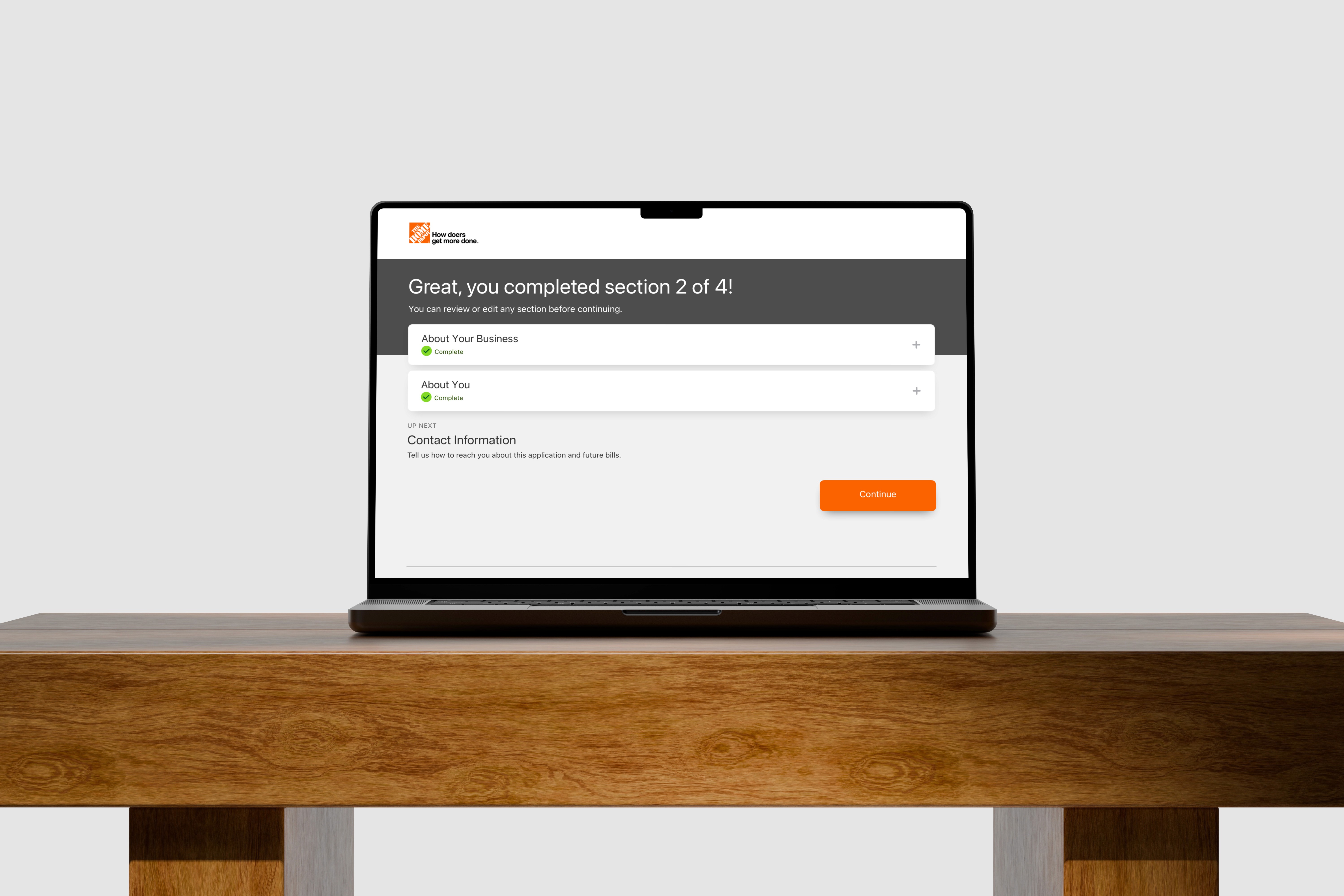
Home Depot Canada's application completion rate lagged behind other partners. Users hit dead-end error messages, unclear legal terms, and a flow that broke when editing answers. I redesigned the experience into a modular flow, with meaningfully improved completion rates after launch.
Customers had to leave Citi’s platform just to redeem rewards they’d already earned. I redesigned the module for full self-service, while making sure the experience stayed accessible by design.
Citi partners with retailers like Best Buy to build credit servicing platforms. This project was the latest iteration of the "My Offers & Rewards" module — spanning four connected modules (Rewards, Notifications, confirmation modals, and error handling).
The Problem: Where the Application Lost Users
Users struggled to track where they were in a long process, and error messages could surface without a clear resolution. Quebec regulations compounded those issues – required information changes based on province and business type, and applicants didn't understand why requirements had shifted partway through.

Additional project visuals
How We Got There
Weighed reordering the flow against adding a screening question
Through an ideation workshop with design, PM, and marketing, we set the problem and generated solutions, then narrowed down against technical, legal, usability constraints. Two options came out of it: reorder the flow so Contact Information comes before Personal Information, or keep the order and add a conditional screening question for the province.
The legal requirement to display terms and conditions immediately after submitting a Quebec address ruled out the second option, so we moved forward with reordering the flow.
Designed the conditional logic
Once a business was established as Quebec-based, the application needed more information. Rather than routing applicants into a separate flow, we built it into the existing structure: an Information drawer that expands with added fields, plus a terms checkbox. Regulation also required a Personal Guarantor, so instead of an editable question, we replaced it with copy explaining why one was required.

Additional project visuals
Questioned legacy form fields without a clear purpose
Reviewing the existing content, I flagged the "Years with Current Employer" dropdown. Its ranges had no clear rationale, so I pushed the team to define what the data was actually used for. It was one piece of a larger audit, but a standard I held to carry it forward only if it still served a purpose.
Caught U.S. references inherited in the framework
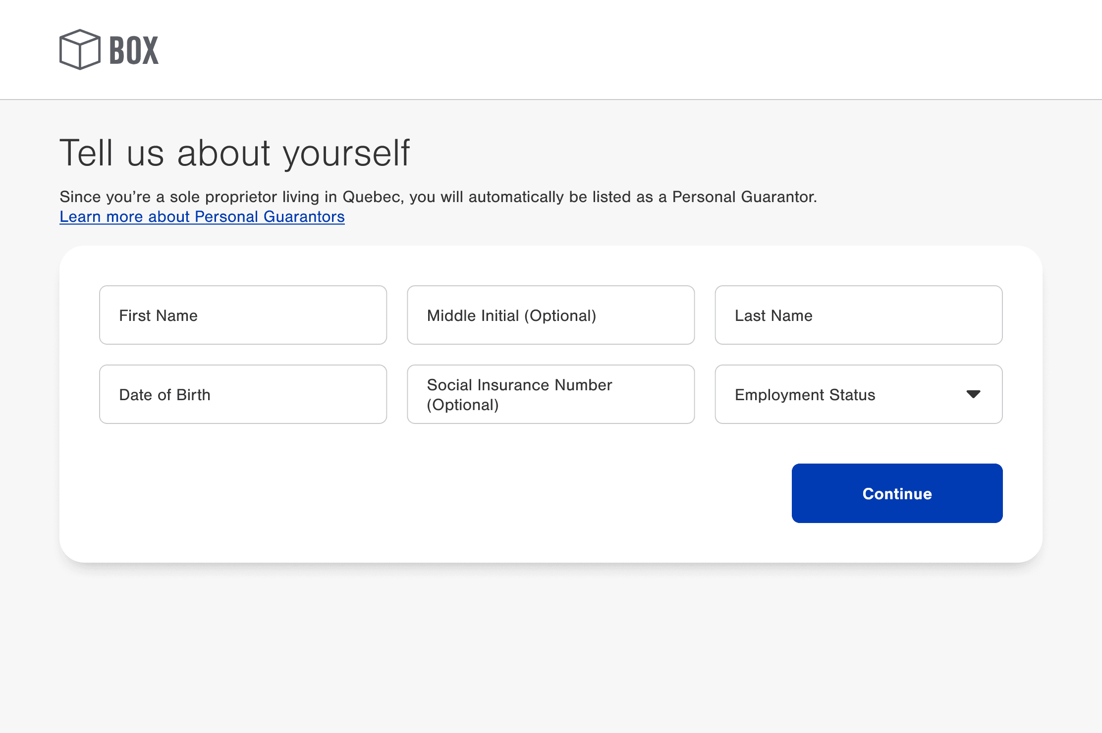
The framework was built for U.S. partners first, so migrating it for Canada surfaced content that didn't fit, like a Social Insurance Number an SSN, and offering Spanish instead of French. I corrected both to match the Canadian market.
Annotated specs
Clarified field types and legal terms
To clarify optional fields, I labeled "optional" directly in placeholder text and field labels. For legal terms, like Personal Guarantor or Authorized Signing Officer, text links were added in the subheader that expanded to plain-language context, without leaving the flow.
Solved a modal conflict on the change flow
Editing a previous section, could add or remove required information elsewhere, with no warning. This was the source of the unclear, blocking errors in the legacy platform. Users would edit an answer, then hit an empty field elsewhere.
We weighed locking the province field, an "undo" link, or triggering the edit flow directly. After weighing the engineering lift, reusing the current design system, and aligning patterns used in other products, I landed on a warning modal that told users upfront how an edit would reshape their requirements, and linked directly to the section, turning it into an expected next step.
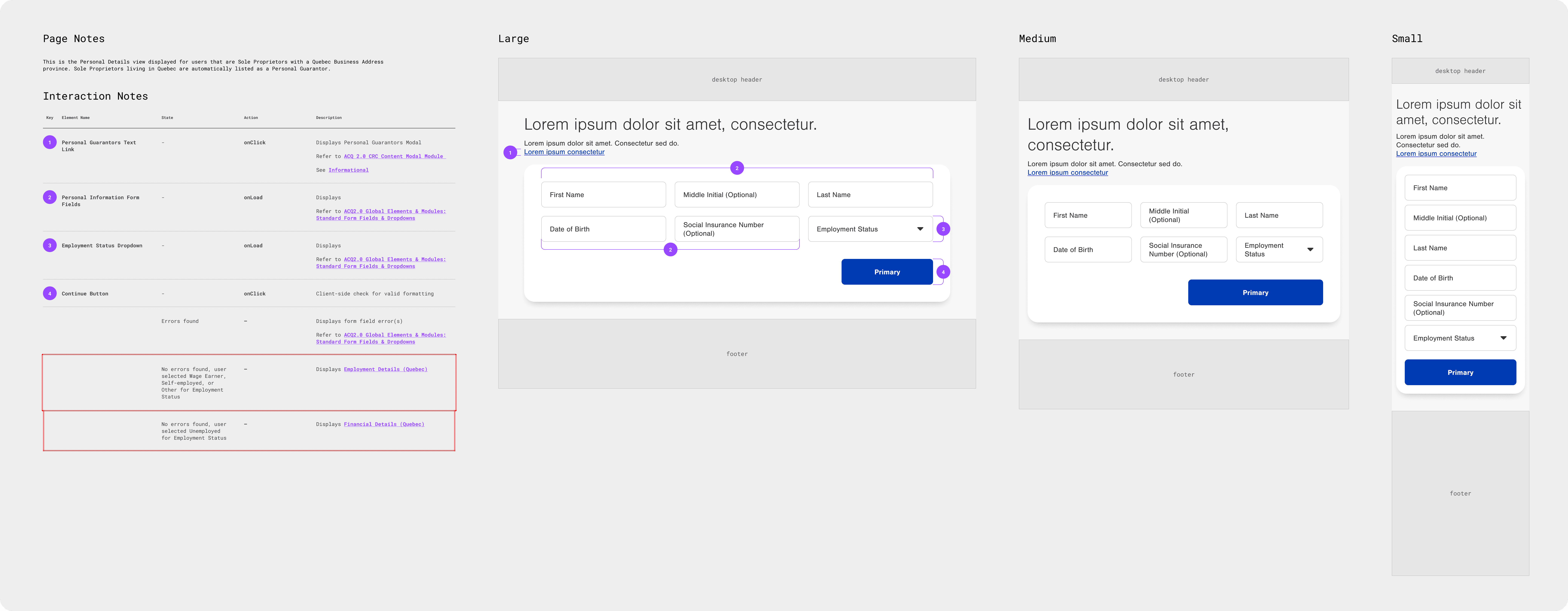
Delivered annotated specs and a prototype for handoff
For handoff, I prepared detailed annotations for each state, with interaction notes and specs across multiple breakpoints. We also built a prototype for the client, with a recommendation to run additional usability testing before launch.
Annotated specs
What We Built
Modular section framework – the single-page legacy application rebuilt as contained sections, with a progress page that builds out as each section completes.
Reordered application flow – Contact Information moved ahead of Personal, so Quebec residency is established early, meeting requirements to show terms immediately after a Quebec address.
Conditional financial information logic – a Financial Information drawer that expands with additional fields, and Sole Proprietors see explanatory copy instead of an editable question.
Change warning modal – flags users before an edit reshapes requirements, chosen over locking the field or an undo link for its lower engineering lift and consistency with the design system.
Clearer optional fields and legal terms – "optional" labeled directly in placeholder text and field labels and text links added on legal and regulatory copy



What Changed
The client reported a meaningful improvement in completion rate, alongside stronger loan growth in that quarter's Commercial Branded Cards revenue.
View the launched product: Commercial Credit Account Application – The Home Depot Canada
Company
Citi | Razorfish
Role
Experience Designer
Timeline
3 Months
Commercial Credit Card Application
Home Depot Canada's application completion rate lagged behind other partners. Users hit dead-end error messages, unclear legal terms, and a flow that broke when editing answers. I redesigned the experience into a modular flow, with meaningfully improved completion rates after launch.
Migrating Home Depot Canada to the Modular Framework
Citi's commercial credit card platform runs as private label cards for retail partners. We already moved other products off the legacy single-page format onto a modular framework, and needed to do the same for Home Depot Canada, while addressing usability issues along the way.
Quebec tax regulations added complexity: certain business types in Quebec are required to submit additional financial information for tax reasons, so the application can shift depending on the business type and province.
Localizing the framework for a Canadian partner meant correcting references built for a U.S. audience, too.
The Problem: Where the Application Lost Users
Users struggled to track where they were in a long process, and error messages could surface without a clear resolution. Quebec regulations compounded those issues – required information changes based on province and business type, and applicants didn't understand why requirements had shifted partway through.
Additional project visuals
How We Got There
Weighed reordering the flow against adding a screening question
Through an ideation workshop with design, PM, and marketing, we set the problem and generated solutions, then narrowed down against technical, legal, usability constraints. Two options came out of it: reorder the flow so Contact Information comes before Personal Information, or keep the order and add a conditional screening question for the province.
The legal requirement to display terms and conditions immediately after submitting a Quebec address ruled out the second option, so we moved forward with reordering the flow.
Designed the conditional logic
Once a business was established as Quebec-based, the application needed more information. Rather than routing applicants into a separate flow, we built it into the existing structure: an Information drawer that expands with added fields, plus a terms checkbox. Regulation also required a Personal Guarantor, so instead of an editable question, we replaced it with copy explaining why one was required.
Additional project visuals
Questioned legacy form fields without a clear purpose
Reviewing the existing content, I flagged the "Years with Current Employer" dropdown. Its ranges had no clear rationale, so I pushed the team to define what the data was actually used for. It was one piece of a larger audit, but a standard I held to carry it forward only if it still served a purpose.
Caught U.S. references inherited in the framework
The framework was built for U.S. partners first, so migrating it for Canada surfaced content that didn't fit, like a Social Insurance Number an SSN, and offering Spanish instead of French. I corrected both to match the Canadian market.
Clarified field types and legal terms
To clarify optional fields, I labeled "optional" directly in placeholder text and field labels. For legal terms, like Personal Guarantor or Authorized Signing Officer, text links were added in the subheader that expanded to plain-language context, without leaving the flow.
Solved a modal conflict on the change flow
Editing a previous section, could add or remove required information elsewhere, with no warning. This was the source of the unclear, blocking errors in the legacy platform. Users would edit an answer, then hit an empty field elsewhere.
We weighed locking the province field, an "undo" link, or triggering the edit flow directly. After weighing the engineering lift, reusing the current design system, and aligning patterns used in other products, I landed on a warning modal that told users upfront how an edit would reshape their requirements, and linked directly to the section, turning it into an expected next step.
Delivered annotated specs and a prototype for handoff
For handoff, I prepared detailed annotations for each state, with interaction notes and specs across multiple breakpoints. We also built a prototype for the client, with a recommendation to run additional usability testing before launch.
Annotated specs
What We Built
Modular section framework – the single-page legacy application rebuilt as contained sections, with a progress page that builds out as each section completes.
Reordered application flow – Contact Information moved ahead of Personal, so Quebec residency is established early, meeting requirements to show terms immediately after a Quebec address.
Conditional financial information logic – a Financial Information drawer that expands with additional fields, and Sole Proprietors see explanatory copy instead of an editable question.
Change warning modal – flags users before an edit reshapes requirements, chosen over locking the field or an undo link for its lower engineering lift and consistency with the design system.
Clearer optional fields and legal terms – "optional" labeled directly in placeholder text and field labels and text links added on legal and regulatory copy
What Changed
The client reported a meaningful improvement in completion rate, alongside stronger loan growth in that quarter's Commercial Branded Cards revenue.
View the launched product: Commercial Credit Account Application – The Home Depot Canada
Company
Citi | Razorfish
Role
Experience Designer
Timeline
3 Months
Commercial Credit Card Application
Home Depot Canada's application completion rate lagged behind other partners. Users hit dead-end error messages, unclear legal terms, and a flow that broke when editing answers. I redesigned the experience into a modular flow, with meaningfully improved completion rates after launch.
Migrating Home Depot Canada to the Modular Framework
Citi's commercial credit card platform runs as private label cards for retail partners. We already moved other products off the legacy single-page format onto a modular framework, and needed to do the same for Home Depot Canada, while addressing usability issues along the way.
Quebec tax regulations added complexity: certain business types in Quebec are required to submit additional financial information for tax reasons, so the application can shift depending on the business type and province.
Localizing the framework for a Canadian partner meant correcting references built for a U.S. audience, too.
The Problem: Where the Application Lost Users
Users struggled to track where they were in a long process, and error messages could surface without a clear resolution. Quebec regulations compounded those issues – required information changes based on province and business type, and applicants didn't understand why requirements had shifted partway through.
Additional project visuals
How We Got There
Weighed reordering the flow against adding a screening question
Through an ideation workshop with design, PM, and marketing, we set the problem and generated solutions, then narrowed down against technical, legal, usability constraints. Two options came out of it: reorder the flow so Contact Information comes before Personal Information, or keep the order and add a conditional screening question for the province.
The legal requirement to display terms and conditions immediately after submitting a Quebec address ruled out the second option, so we moved forward with reordering the flow.
Designed the conditional logic
Once a business was established as Quebec-based, the application needed more information. Rather than routing applicants into a separate flow, we built it into the existing structure: an Information drawer that expands with added fields, plus a terms checkbox. Regulation also required a Personal Guarantor, so instead of an editable question, we replaced it with copy explaining why one was required.
Additional project visuals
Questioned legacy form fields without a clear purpose
Reviewing the existing content, I flagged the "Years with Current Employer" dropdown. Its ranges had no clear rationale, so I pushed the team to define what the data was actually used for. It was one piece of a larger audit, but a standard I held to carry it forward only if it still served a purpose.
Caught U.S. references inherited in the framework
The framework was built for U.S. partners first, so migrating it for Canada surfaced content that didn't fit, like a Social Insurance Number an SSN, and offering Spanish instead of French. I corrected both to match the Canadian market.
Clarified field types and legal terms
To clarify optional fields, I labeled "optional" directly in placeholder text and field labels. For legal terms, like Personal Guarantor or Authorized Signing Officer, text links were added in the subheader that expanded to plain-language context, without leaving the flow.
Solved a modal conflict on the change flow
Editing a previous section, could add or remove required information elsewhere, with no warning. This was the source of the unclear, blocking errors in the legacy platform. Users would edit an answer, then hit an empty field elsewhere.
We weighed locking the province field, an "undo" link, or triggering the edit flow directly. After weighing the engineering lift, reusing the current design system, and aligning patterns used in other products, I landed on a warning modal that told users upfront how an edit would reshape their requirements, and linked directly to the section, turning it into an expected next step.
Delivered annotated specs and a prototype for handoff
For handoff, I prepared detailed annotations for each state, with interaction notes and specs across multiple breakpoints. We also built a prototype for the client, with a recommendation to run additional usability testing before launch.
Annotated specs
What We Built
Modular section framework – the single-page legacy application rebuilt as contained sections, with a progress page that builds out as each section completes.
Reordered application flow – Contact Information moved ahead of Personal, so Quebec residency is established early, meeting requirements to show terms immediately after a Quebec address.
Conditional financial information logic – a Financial Information drawer that expands with additional fields, and Sole Proprietors see explanatory copy instead of an editable question.
Change warning modal – flags users before an edit reshapes requirements, chosen over locking the field or an undo link for its lower engineering lift and consistency with the design system.
Clearer optional fields and legal terms – "optional" labeled directly in placeholder text and field labels and text links added on legal and regulatory copy
What Changed
The client reported a meaningful improvement in completion rate, alongside stronger loan growth in that quarter's Commercial Branded Cards revenue.
View the launched product: Commercial Credit Account Application – The Home Depot Canada