Company
Best Buy | Razorfish
Role
Experience Designer
Timeline
3 Months
Rewards Redemption & Preferences
Customers had to leave Citi's platform to redeem rewards they'd already earned. I redesigned it for full self-service, while ensuring accessibility.

Enhancing the Rewards Module
Citi partners with retailers like Best Buy to build credit servicing platforms. This project was the latest iteration of the "My Offers & Rewards" module — spanning four connected modules (Rewards, Notifications, confirmation modals, and error handling).
The Problem: View-Only Capabilities
The existing module let customers see their point balance and current issuing preferences – but taking action, like issuing a certificate or changing how rewards were handled, required leaving Citi's platform for Best Buy's site. Customer feedback described frustration at having to jump to a separate site just to manage rewards they'd already earned.

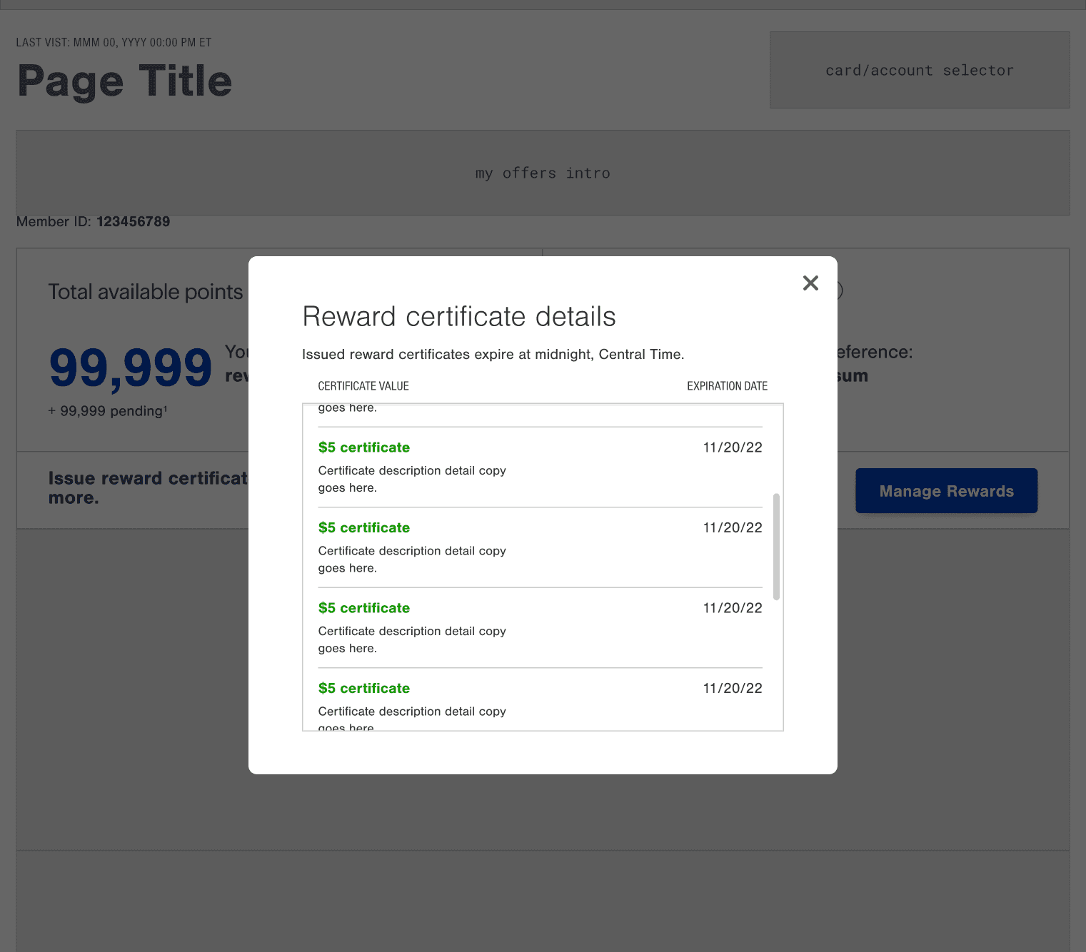
Original mobile design with view-only capabilities (left); view-only version of certificate details (right)

Original design with view-only capabilities
How We Got There
We worked async in Freehand, reviewing wireframes and open questions directly with Best Buy and Citi stakeholders rather than through separate decks. The work broke into three areas: how customers would issue certificates, how they'd manage their issuing preferences, and how they'd be notified when something changed.
Compared the current experience against what needed to change
Comparing the current functionality against the new module, one open question was whether to support printing certificates. We asked Best Buy directly for data on how often users interact with the printing feature – the answer was that it happens rarely, so we deprioritized it to keep scope focused.

Freehand board with asynchronous collaboration
Mapped the range of user states needed
The certificate tiers start at a minimum of 250 points to issue a reward, so the module needed to handle the common occurrence where users didn't have enough to issue anything yet. I designed empty states to suppress the issuance controls, links to display issued certificates, and added updated copy that adapts to the user's actual balance.


Empty state design (left); annotations with empty state notes (right)


Early iteration of confirmation modal (left); updated design with notification banner (right)
Reconsidered the need for confirmation modals
Early explorations included a full confirmation modal with Cancel/Confirm actions. Confirmation modals are best reserved for actions that are high-stakes or hard to undo. Issuing a certificate is technically not reversible, but it's low-stakes and easy to recover from. Recognizing that, I moved away from the modal in favor of a notification banner, which still gave users clear feedback without an unnecessary extra step.
Iterated on the preference-selection layout, with accessibility in mind
An early version of the "Change Preference" modal used a dropdown with the current selection awkwardly embedded inside it, which raised a labeling problem for screen readers. I pivoted to a radio button pattern with all selection options displayed, matching a pattern already used in other areas of the product, giving the control the label it needed.

Layout exploration of the Preferences Modal
What We Built
The final design gave customers full self-service over their rewards, directly on Citi's platform:
Dynamic issuance module – a dropdown scoped only to certificate values the user could actually afford, paired with an empty state for users below the 250-point threshold, matching Best Buy's existing pattern to reduce relearning cost for returning users.
Preference management modal – a radio button selector for choosing between Point Banking and Auto-Issue, with clear labeling for accessibility and the current selection visibly marked.
Real-time notification system, replacing a page-refresh requirement – confirmation when a certificate is issuing, a "ready to use" notification once available, and a warning before certificates expire.
Clear error states – for both certificate issuance and preference changes, surfacing actionable messaging instead of failing silently.


What Changed
Customers previously had to leave Citi's platform to redeem rewards they'd already earned or to change their redemption preferences. In the redesigned flow, redemption takes only 2 steps – selecting a value, and submitting that action, cutting out a barrier between intent and action.
It also stayed accessible throughout, with screenreader-friendly controls and a lighter confirmation pattern that gave clear feedback without unnecessary friction.
Company
Best Buy | Razorfish
Role
Experience Designer
Timeline
3 Months
Rewards Redemption & Preferences
Customers had to leave Citi's platform to redeem rewards they'd already earned. I redesigned it for full self-service, while ensuring accessibility.
Enhancing the Rewards Module
Citi partners with retailers like Best Buy to build credit servicing platforms. This project was the latest iteration of the "My Offers & Rewards" module — spanning four connected modules (Rewards, Notifications, confirmation modals, and error handling).
The Problem: View-Only Capabilities
The existing module let customers see their point balance and current issuing preferences – but taking action, like issuing a certificate or changing how rewards were handled, required leaving Citi's platform for Best Buy's site. Customer feedback described frustration at having to jump to a separate site just to manage rewards they'd already earned.
Original design with view-only capabilities
Original mobile design with view-only capabilities (left); view-only version of certificate details (right)
How We Got There
We worked async in Freehand, reviewing wireframes and open questions directly with Best Buy and Citi stakeholders rather than through separate decks. The work broke into three areas: how customers would issue certificates, how they'd manage their issuing preferences, and how they'd be notified when something changed.
Compared the current experience against what needed to change
Comparing the current functionality against the new module, one open question was whether to support printing certificates. We asked Best Buy directly for data on how often users interact with the printing feature – the answer was that it happens rarely, so we deprioritized it to keep scope focused.
Freehand board with asynchronous collaboration
Mapped the range of user states needed
The certificate tiers start at a minimum of 250 points to issue a reward, so the module needed to handle the common occurrence where users didn't have enough to issue anything yet. I designed empty states to suppress the issuance controls, links to display issued certificates, and added updated copy that adapts to the user's actual balance.
Empty state design (left); annotations with empty state notes (right)
Reconsidered the need for confirmation modals
Early explorations included a full confirmation modal with Cancel/Confirm actions. Confirmation modals are best reserved for actions that are high-stakes or hard to undo. Issuing a certificate is technically not reversible, but it's low-stakes and easy to recover from. Recognizing that, I moved away from the modal in favor of a notification banner, which still gave users clear feedback without an unnecessary extra step.
Early iteration of confirmation modal (left); updated design with notification banner (right)
Iterated on the preference-selection layout, with accessibility in mind
An early version of the "Change Preference" modal used a dropdown with the current selection awkwardly embedded inside it, which raised a labeling problem for screen readers. I pivoted to a radio button pattern with all selection options displayed, matching a pattern already used in other areas of the product, giving the control the label it needed.
Layout exploration of the Preferences Modal
What We Built
The final design gave customers full self-service over their rewards, directly on Citi's platform:
Dynamic issuance module – a dropdown scoped only to certificate values the user could actually afford, paired with an empty state for users below the 250-point threshold, matching Best Buy's existing pattern to reduce relearning cost for returning users.
Preference management modal – a radio button selector for choosing between Point Banking and Auto-Issue, with clear labeling for accessibility and the current selection visibly marked.
Real-time notification system, replacing a page-refresh requirement – confirmation when a certificate is issuing, a "ready to use" notification once available, and a warning before certificates expire.
Clear error states – for both certificate issuance and preference changes, surfacing actionable messaging instead of failing silently.
What Changed
Customers previously had to leave Citi's platform to redeem rewards they'd already earned or to change their redemption preferences. In the redesigned flow, redemption takes only 2 steps – selecting a value, and submitting that action, cutting out a barrier between intent and action.
It also stayed accessible throughout, with screenreader-friendly controls and a lighter confirmation pattern that gave clear feedback without unnecessary friction.
Company
Best Buy | Razorfish
Role
Experience Designer
Timeline
3 Months
Rewards Redemption & Preferences
Customers had to leave Citi's platform to redeem rewards they'd already earned. I redesigned it for full self-service, while ensuring accessibility.
Enhancing the Rewards Module
Citi partners with retailers like Best Buy to build credit servicing platforms. This project was the latest iteration of the "My Offers & Rewards" module — spanning four connected modules (Rewards, Notifications, confirmation modals, and error handling).
The Problem: View-Only Capabilities
The existing module let customers see their point balance and current issuing preferences – but taking action, like issuing a certificate or changing how rewards were handled, required leaving Citi's platform for Best Buy's site. Customer feedback described frustration at having to jump to a separate site just to manage rewards they'd already earned.
Original mobile design with view-only capabilities (left); view-only version of certificate details (right)
Original design with view-only capabilities
How We Got There
We worked async in Freehand, reviewing wireframes and open questions directly with Best Buy and Citi stakeholders rather than through separate decks. The work broke into three areas: how customers would issue certificates, how they'd manage their issuing preferences, and how they'd be notified when something changed.
Compared the current experience against what needed to change
Comparing the current functionality against the new module, one open question was whether to support printing certificates. We asked Best Buy directly for data on how often users interact with the printing feature – the answer was that it happens rarely, so we deprioritized it to keep scope focused.
Freehand board with asynchronous collaboration
Mapped the range of user states needed
The certificate tiers start at a minimum of 250 points to issue a reward, so the module needed to handle the common occurrence where users didn't have enough to issue anything yet. I designed empty states to suppress the issuance controls, links to display issued certificates, and added updated copy that adapts to the user's actual balance.
Empty state design (left); annotations with empty state notes (right)
Early iteration of confirmation modal (left); updated design with notification banner (right)
Reconsidered the need for confirmation modals
Early explorations included a full confirmation modal with Cancel/Confirm actions. Confirmation modals are best reserved for actions that are high-stakes or hard to undo. Issuing a certificate is technically not reversible, but it's low-stakes and easy to recover from. Recognizing that, I moved away from the modal in favor of a notification banner, which still gave users clear feedback without an unnecessary extra step.
Iterated on the preference-selection layout, with accessibility in mind
An early version of the "Change Preference" modal used a dropdown with the current selection awkwardly embedded inside it, which raised a labeling problem for screen readers. I pivoted to a radio button pattern with all selection options displayed, matching a pattern already used in other areas of the product, giving the control the label it needed.
Layout exploration of the Preferences Modal
What We Built
The final design gave customers full self-service over their rewards, directly on Citi's platform:
Dynamic issuance module – a dropdown scoped only to certificate values the user could actually afford, paired with an empty state for users below the 250-point threshold, matching Best Buy's existing pattern to reduce relearning cost for returning users.
Preference management modal – a radio button selector for choosing between Point Banking and Auto-Issue, with clear labeling for accessibility and the current selection visibly marked.
Real-time notification system, replacing a page-refresh requirement – confirmation when a certificate is issuing, a "ready to use" notification once available, and a warning before certificates expire.
Clear error states – for both certificate issuance and preference changes, surfacing actionable messaging instead of failing silently.